Perhaps the most amazing map ever created by mankind has just been published by astronomers from the Dark Energy Survey collaboration. It’s either this map below or the latest Cosmic Microwave Background map from the Planck satellite. Personally, I find this new map of our “neighborhood” more exciting and esthetic, as it shows the explicit locations of several hundred clusters of galaxies together with the distribution of dark matter across a very large scale.
The Dark Energy Camera (DECam) is a 570 Megapixel system designed by the DES collaboration for deep galaxy survey work. It sits at the focal plane of the 4 meter Victor M. Blanco telescope at the National Optical Astronomy Observatory’s Cerro Tololo Inter-American Observatory in Chile. The Dark Energy Survey team will acquire data over a 5-year period. This is the first map released, based on a small percentage of the data that will ultimately be collected.
Over 2 million galaxies were observed with DECam to create this map, and a supercomputer was required to analyze the data and compare it to theoretical expectations for dark matter and galaxy distributions. The map shows the distribution of dark matter, clusters of galaxies, and matter filaments and voids in a field of 139 square degrees. That’s roughly 1/2 billion light-years or so in the horizontal direction and in the vertical direction.
The redshifts, and thus distances, of the galaxies in the survey sample have been determined photometrically, by comparing the luminosity of a given galaxy in various wave bands in the optical and infrared regions of the spectrum. About 1 million of the galaxies in the survey are background galaxies with redshifts above 0.6, and another million plus are foreground galaxies with redshifts below 0.5. The higher the redshift, the more distant the galaxy, since the universe is expanding in a uniform fashion. The redshift measures the shift of light toward the red end of the spectrum as it is “stretched out” along with this expansion.
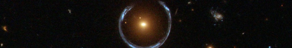
The light from background galaxies is distorted as it passes through concentrations of dark matter on its way to the Earth and the DECam. This is due to gravitational lensing, a consequence of Einstein’s general relativity. A background galaxy’s image will shear in proportion to the strength of the gravitational field its light encounters during its journey to the Earth.
The amount of shear seen by each of the million or so background galaxies is used to infer the map of the distribution of dark matter at redshift 0.5 and below. This corresponds to a lookback time of up to 5 billion years. Coincidentally, the redshift of 0.5 is around the time when dark energy began to be more important than dark matter, and the expansion of the universe began to accelerate, rather than decelerate.
The dots on the map are not individual galaxies; rather they are rich clusters of galaxies. Each cluster is a gravitationally bound system, dominated by dark matter, and containing 100s to 1000s of galaxies. Typically the galaxies themselves contribute only about 1% of a cluster’s mass, and the dark matter can contribute up to 90% of the total. The remainder is found as hot X-ray emitting gas residing between galaxies, but still bound to the cluster due to the predominant gravitational potential contribution from the dark matter.
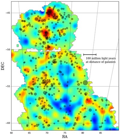
DES map of dark matter density
The red areas on the map represent the highest concentrations of dark matter, the orange and yellow areas the next highest, and the blue areas the lowest. These blue areas are called voids because of their low density of dark matter and clusters of galaxies. One clearly sees the existence of dark matter filamentary structures in the red, orange, yellow colors.
Clusters of galaxies are represented by the gray dots, and the larger the dot, the “richer” or larger the cluster. It’s evident to the eye that the clusters are preferentially found in the same locations as the reddish areas and yellow filaments. They are scarcely to be found in the blue-colored voids. The point is that the ordinary matter, which is most concentrated in galaxy clusters, follows the dark matter density, as expected.
Peruse the map, and let your mind wander out into the vast reaches of intergalactic space.
This is just the beginning; this map was created from the very preliminary observations made in the DES. The survey team plans to eventually acquire 35 times as much coverage of the sky as this map provides. The full survey is expected to advance our knowledge of the nature and distribution of both dark matter and dark energy substantially.
The press release of April 13th announcing this truly amazing map can be found here: http://www.fnal.gov/pub/presspass/press_releases/2015/Mapping-The-Cosmos-20150413.html
“The Dark Energy Survey is a collaboration of more than 300 scientists from 25 institutions in six countries. Its primary instrument, the Dark Energy Camera, is mounted on the 4-meter Blanco telescope at the National Optical Astronomy Observatory’s Cerro Tololo Inter-American Observatory in Chile, and its data is processed at the National Center for Supercomputing Applications at the University of Illinois at Urbana-Champaign.”

April 15th, 2015 at 6:06 pm
You can see this map as showing how the galaxies cluster in the protective shade of dark matter. But there are some out in the bright light, particularly around 76RA/58DEC. Why? Are they different kinds of galaxies, or is it just a perspective effect? Although in sum that direction of the sky is dark blue, there may be a filament of dark matter at a particular distance which shelters those galaxies too.
April 15th, 2015 at 9:17 pm
Probably perspective.